
AMEN CLINICS / CUSTOMER INTELLIGENCE / HEALTHCARE
Listen closely.
Design deliberately.
The research behind
a more relevant patient conversation.
Competitor reviews, caller objections, community language and the competitive experience, brought together before changing the page.
Based on five research views, two page excerpts and a recovered original consultation-form capture. This is an overview of research and design hypotheses, not a full-page comparison or a measured conversion result. Clinical and patient-count claims in the designs are not validated here.
Explore the evidence together.
Click any sheet to inspect it.
What does a patient need
to believe before calling?
The supplied research describes people frustrated by unsuccessful treatment, uncertain explanations and the feeling that their needs have not been understood. Community discussions also emphasize everyday functioning and emotional burden.
The call-analysis screenshot identifies cost and insurance, travel logistics, information needs and skepticism as barriers. A more persuasive headline alone cannot answer all four.
WHAT EACH VIEW CONTRIBUTES
A connected view
of the decision.
What people judge.
The comparison dashboard covers 13 named companies and themes including support, appointments, care, billing, access and insurance. It reveals which parts of the experience need attention beyond the offer itself.
Where the experience disappoints.
Theme-level positive, negative and neutral counts add context to volume. A topic appearing often is different from a topic producing dissatisfaction. Comparing companies also requires accounting for their unequal review volumes.
Why interest does not become a booking.
The supplied chart reports cost or coverage at 71.2%, travel at 37.4%, needing more information at 24.9% and skepticism at 22.2%. The categories exceed 100% combined; do not treat them as mutually exclusive slices.
How people describe the struggle.
Keywords, topic modeling, phrases and engagement cues point toward daily functioning, relationships and emotional relatability. These are research leads for message testing, not proof that a particular phrase converts.
How the category frames the choice.
The matrix compares offers, audiences, promises, CTAs, trust signals and weaknesses. Its Amen Clinics row pairs memorable differentiation with a high skepticism burden, suggesting that stronger positioning needs stronger explanation and proof.
Keep the source context.
The screenshots do not supply the underlying datasets, collection dates, coding rules, denominators or model validation. Theme counts and discussion documents must not be combined into a claimed number of unique patients.
RESEARCH → DESIGN HYPOTHESES
Turn the insight
into a useful change.
| Research signal | Design implication | What is visible in the revision | What remains to answer |
|---|---|---|---|
| Frustration with repeated treatment and uncertain explanations | Acknowledge the experience before presenting the clinic | “The problem isn’t you” and “No one looked closely enough” replace a general first-step message | Test relevance and trust; avoid implying all previous care was inadequate |
| Desire for a tailored plan | Explain what makes the evaluation and plan specific | “Built for you, not for everyone” and “Get a plan built for your brain” | Support the differentiation with accurate process and evidence |
| Cost and coverage concerns | Clarify the initial commitment and subsequent costs | A complimentary-consultation CTA with reassurance beneath it | A free consultation does not resolve evaluation cost or insurance uncertainty |
| Travel and logistics | Make locations and attendance requirements easy to evaluate | The supplied hero retains a telephone contact | The excerpt does not show an answer to distance, scheduling or visit logistics |
| Skepticism about the scan or approach | Pair claims with clear, relevant evidence | Clinic tenure and a patient-count trust line near the CTA | Volume and tenure do not prove clinical effectiveness; explain the actual evidence |
| Everyday functioning and emotional burden | Connect the offer to recognizable situations | A supportive parent-child image and a more empathetic introduction | Test comprehension and fit across adults and parents, not just one audience |
THE DESIGN EXPRESSION / PROVIDED EXCERPTS
Two views of the opening.
One change in positioning.

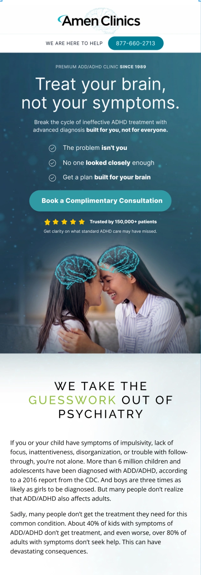
The original is a desktop view; the revision is a mobile view. Each is shown at its own proportions. These source images end before the lower page and consultation form.
What changed
The original starts with “This is the first step for ADD / ADHD to get better” and a small outlined appointment CTA. The revised mobile hero adds clinic tenure, a stronger differentiating headline, three reassurance bullets, a large consultation CTA and proof immediately below it.
Why it may help
The new sequence acknowledges frustration, states a different approach and clarifies the next action. The hierarchy makes the consultation more prominent and places reassurance near the decision. These choices are consistent with the research signals, but their causal effect has not been measured here.
What is retained
The parent-child image and “We take the guesswork out of psychiatry” section remain visible. The revised crop shows that the broader educational copy still follows the hero, so the new positioning must remain coherent with the rest of the page.
What needs validation
These excerpts use different devices and show only the beginning of each page. They cannot establish a full responsive redesign. Verify contact details, consultation terms, tenure and the 150,000+ patient claim. Have clinicians review the headline and diagnostic claims before use.
THE FINAL STEP / CONSULTATION REQUEST
Interest becomes
a conversation.

The original request
The form asks for first and last name, email, clinic, phone, referral source and a message. Permission to respond sits alongside separate text-message and weekly-email choices. The final button says “Send Message.”
Effort at the decision point
Contact details enable follow-up. Clinic selection helps establish location fit. The referral question, open message and additional opt-ins increase the number of decisions between interest and submission.
Clarity about the next step
The closing headline promises healing, while the button describes sending a message. A consultation request should make the immediate action and expected follow-up clear, so the visitor understands what happens after submitting.
THE OUTCOME TO MEASURE
Better understanding.
Better qualified conversations.
Test qualified consultation bookings and attended appointments per visitor. Track contact rate, cost-related objections, location fit and no-shows. Research can strengthen the hypothesis; the experiment must establish whether the revised page improves the actual patient enquiry journey.
Source: the seven project screenshots and the original Amen Clinics full-page capture dated April 13, 2026. Screenshots preserve the research views as provided. The portfolio spread is a visual arrangement of those source images; it does not recreate or recalculate their charts.
Discuss your customer research +