01 / HERO + OFFER
The first screen earns the next scroll.


Before
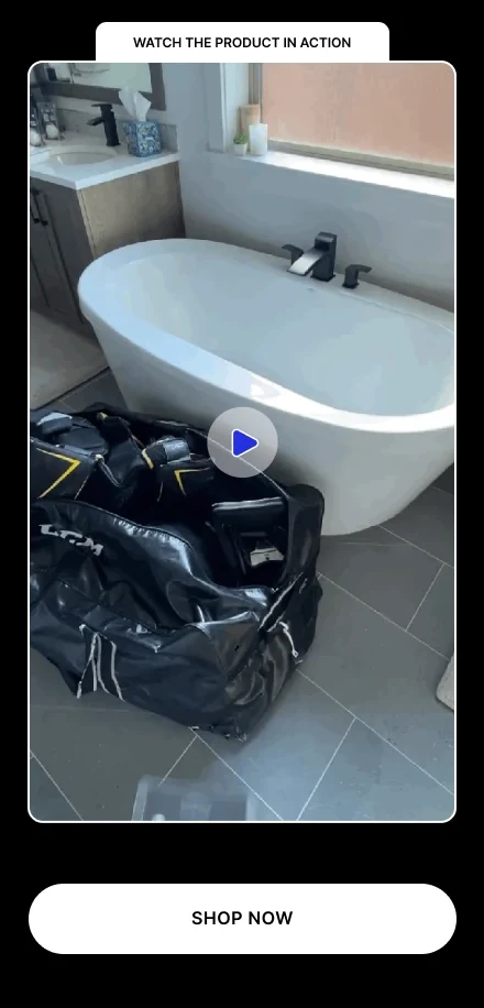
The original opens with a lifestyle product photograph, then a headline, benefits, green CTA and oversized assurance badges.
What changed
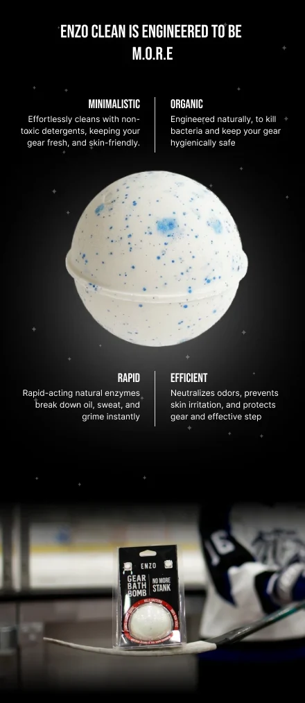
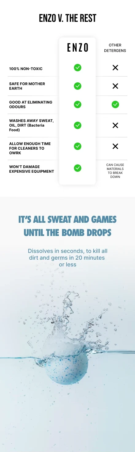
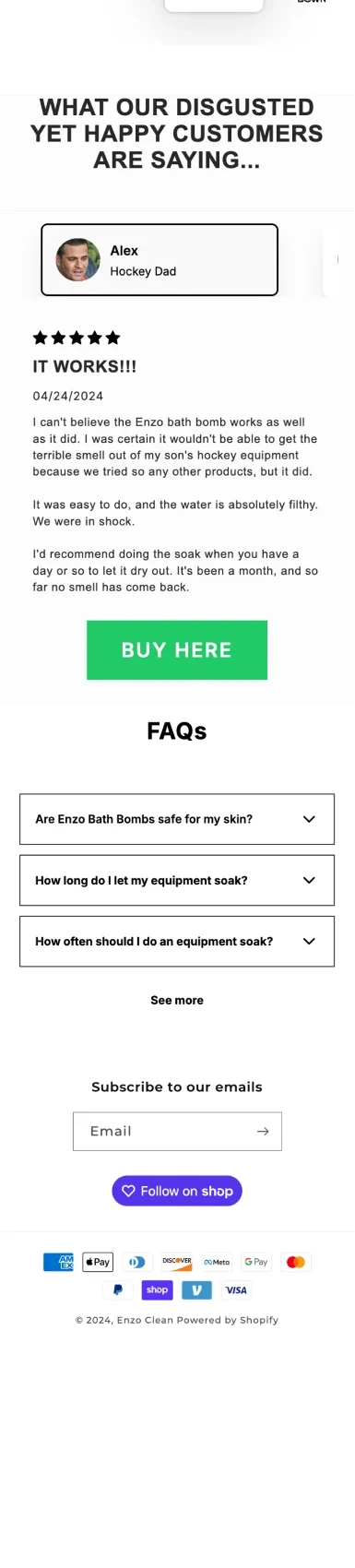
The revision places review reassurance near the headline, gives the bath bomb a stronger product silhouette, and compresses reassurance below the main CTA. The announcement explicitly combines the six-pack discount with shipping.
The design hypothesis
A clearer hierarchy helps visitors identify the product, its promised benefit and the next action. Compact reassurance preserves room for the product story on mobile.
What to validate
Hero CTA clicks and purchase conversion. Confirm the displayed review count and keep the offer consistent with checkout.