ADE MOJINSONFRACTIONAL CRO MANAGERAll selected work ↗

DESIGN BREAKDOWN / ENZO CLEAN / ECOMMERCE

Anatomy of an
optimization.

A bath bomb for sports equipment.
A page redesigned around the buying decision.

From the first promise to the pack selector: what changed, why it may help, and what still needs validation.

THE EVIDENCE BOUNDARY

This is a comparison of the supplied Figma designs, not a measured A/B test result. The rationale below is our interpretation of the design. No conversion uplift is claimed.

THE BIGGEST CHANGE / THE ORDER OF THE ARGUMENT

Explain. Demonstrate.
Then make choosing easier.

ORIGINAL

Product → customer photos → mechanism & usage → problem → three product cards → lifestyle & videos → comparison → reviews & FAQ

REVISED

Product → problem → mechanism → cost argument → usage & demonstration → comparison → consolidated pack selector → community, reviews & FAQ

01 / HERO + OFFER

The first screen earns the next scroll.

Before

The original opens with a lifestyle product photograph, then a headline, benefits, green CTA and oversized assurance badges.

What changed

The revision places review reassurance near the headline, gives the bath bomb a stronger product silhouette, and compresses reassurance below the main CTA. The announcement explicitly combines the six-pack discount with shipping.

The design hypothesis

A clearer hierarchy helps visitors identify the product, its promised benefit and the next action. Compact reassurance preserves room for the product story on mobile.

What to validate

Hero CTA clicks and purchase conversion. Confirm the displayed review count and keep the offer consistent with checkout.

02 / PROBLEM AWARENESS

Make the invisible problem visible.

Before

The original explains the source of odour later, after customer photos and usage instructions.

What changed

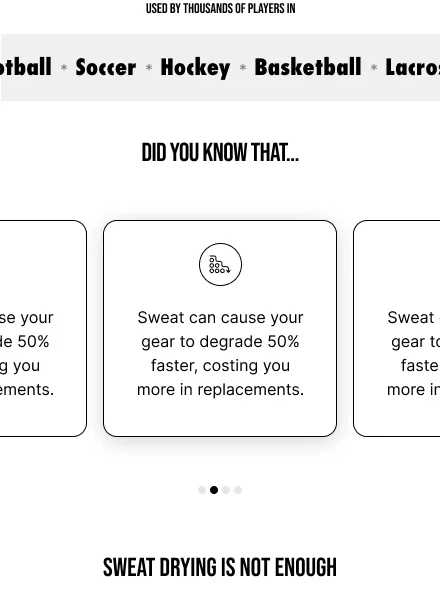
The revision introduces sports context and a “Did you know” sequence immediately after the hero, ending with “Sweat drying isn’t enough.”

The design hypothesis

This changes the argument from “buy a cleaner” to “understand why your current routine may leave a problem unresolved.” The sport labels can help visitors recognize their own equipment.

What to validate

Progression to product education. The repeated problem-card copy is still a draft issue; replace it with distinct, substantiated points.

03 / PRODUCT EXPLANATION

Give the promise a mechanism.

Before

An annotated bath-bomb image describes cleaning ingredients, but the explanatory hierarchy is relatively shallow.

What changed

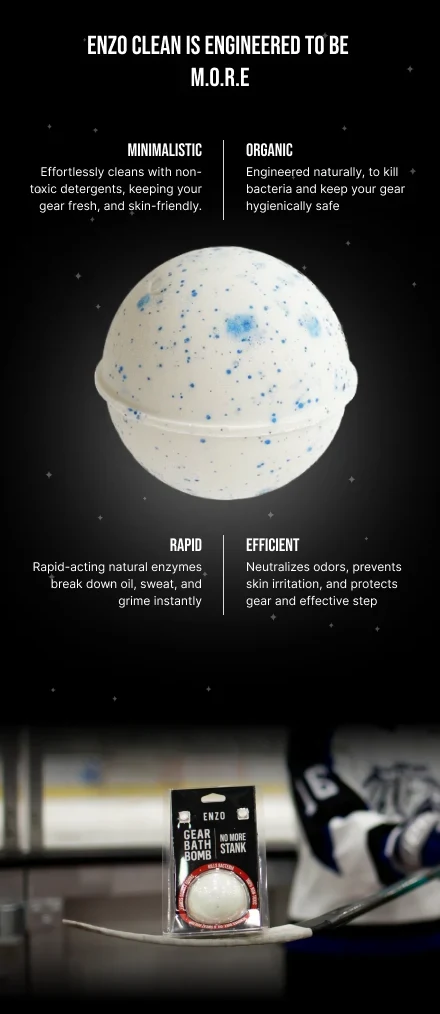
The M.O.R.E framework groups the proposition into Minimalistic, Organic, Rapid and Efficient around a large annotated product graphic.

The design hypothesis

Chunking creates four memorable ideas. Connecting each label to a mechanism can make an unfamiliar bath-bomb format easier to evaluate.

What to validate

Comprehension and purchase intent. Terms such as “organic,” “non-toxic” and bacteria-killing claims need evidence and precise definitions.

04 / VALUE FRAMING

Reframe price as a maintenance decision.

Before

The original anchors value mainly through pack prices and a “Best Value” ribbon.

What changed

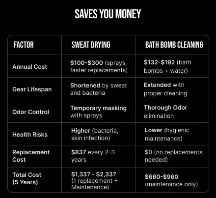
The revision adds a cost table comparing sweat drying with bath-bomb cleaning, covering annual cost, gear lifespan, odour and a five-year total.

The design hypothesis

Showing the wider cost of a routine can change the comparison from price per bomb to maintenance value. A table lets visitors inspect the argument rather than rely on a slogan.

What to validate

Revenue per visitor and margin. This is a proposed cost model, not measured savings: document its assumptions and revise the “no replacements needed” assertion.

05 / USAGE INSTRUCTIONS

Reduce uncertainty about the work involved.

Before

The original uses a tall black sequence of icons and instructions.

What changed

The revision presents four numbered-style instructional blocks with consistent typography: prepare the bathtub, soak equipment, rinse and dry, then clean the bathtub.

The design hypothesis

A predictable sequence makes the required effort easier to estimate. It addresses the practical objection: “Will I actually be able to use this?”

What to validate

Instruction comprehension and support enquiries. Resolve the overnight soaking instruction versus the later “20 minutes or less” claim before launch.

06 / DEMONSTRATION

Let the visitor inspect the product in action.

Before

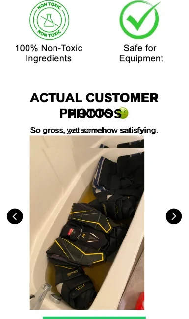
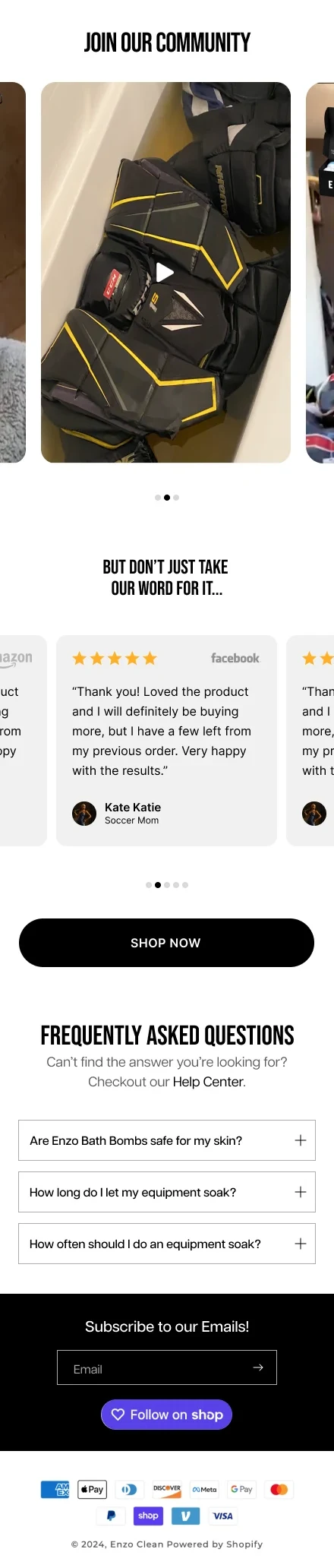
Customer bathtub imagery appears early, while several TikTok-style videos are grouped much later.

What changed

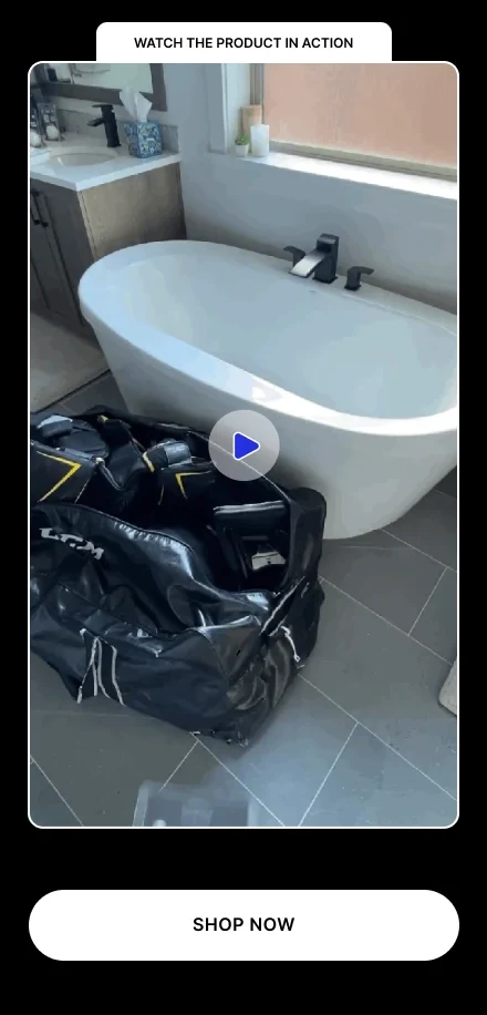
A dedicated “Watch the product in action” block sits after the instructions with a nearby shopping CTA.

The design hypothesis

Placing demonstration beside usage can connect the explanation to observable evidence. The image supports the cleaning story, but dirty water alone does not prove disinfection.

What to validate

Video engagement followed by add-to-cart. The Figma export is a static image; playback behaviour cannot be assessed here.

07 / ALTERNATIVES + TRANSITION

Answer “why this?” before asking for the order.

Before

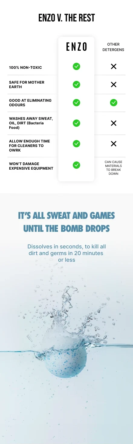
The comparison table follows the product cards and a long social-video sequence.

What changed

The revision moves the alternatives table before the purchase module, then uses a contrasting blue water section to transition into shopping.

The design hypothesis

Visitors can evaluate the claimed differences before choosing a pack. The colour break gives the long page a visible change of pace and marks the shift from education to action.

What to validate

Purchase-module reach and conversion. Define the competing detergents and substantiate each comparison; the blanket claims currently exceed what the design proves.

08 / PURCHASE MODULE

One decision surface. Three pack choices.

Before

Three large cards repeat images, descriptions and individual Add to Bag buttons. The single-pack card also contains unrelated skincare benefits in the supplied original.

What changed

The revision consolidates a product gallery, rating, availability message and three pack choices into one module with one Add to cart button. Per-bomb prices and savings appear beside the total.

The design hypothesis

Adjacent choices reduce the need to remember prices across a long scroll. A featured six-pack makes the value comparison explicit, while removing unrelated copy restores product coherence.

What to validate

Pack-selection accuracy, add-to-cart, purchase conversion, pack mix and contribution margin. “Only a few left” must reflect real stock. The Figma design does not verify selection behaviour.

09 / COMMUNITY + REVIEWS + FAQ

Close the remaining doubts with relevant proof.

Before

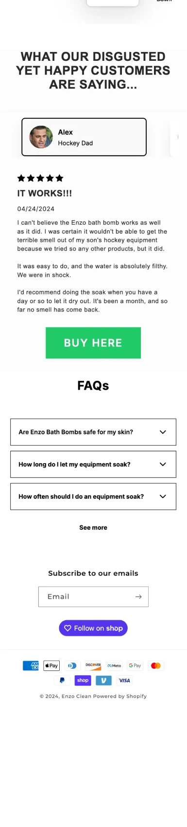
The original ends with a long testimonial, a purchase CTA and FAQs after the comparison.

What changed

The revision groups community imagery, shorter testimonial cards and FAQs after the purchase module, with another shopping CTA above the FAQ.

The design hypothesis

This gives hesitant visitors additional reassurance and answers practical questions without reopening the entire product explanation. Short cards improve scanning, provided they retain meaningful context.

What to validate

Assisted conversions and FAQ use. The revised testimonial cards repeat the same quote and name, and one role label is misspelled. Replace duplicates with authentic, distinct reviews.

FROM DESIGN TO EVIDENCE

A better argument.
Now test the decision.

Test the revised experience against the original with purchase conversion as the primary outcome. Track revenue per visitor, contribution margin and pack mix as guardrails. Section engagement can help diagnose the journey, but it is not proof of commercial improvement.

Compared: original frame 1:5463 and revised frame 1:3078. The file also contains frame 1:1217, an alternative revision retaining stacked pack cards. Screenshots are static design exports; they do not establish live interaction, accessibility or performance.

Discuss your buying journey +