ADE MOJINSONFRACTIONAL CRO MANAGERAll selected work ↗

FRYE / ANTELOPE VALLEY DISC CENTER / LEAD GENERATION

Beyond the lead.
Before the visit.

From a consultation offer
to a fuller patient decision journey.

Twelve comparisons covering the promise, contact choices, evidence, treatment explanation, qualification and the final route to care.

THE EVIDENCE BOUNDARY

A design analysis, not a measured test result or validation of clinical claims. Figures about patients and treatment are claims displayed in the supplied design, not growth results. New sections are labeled as additions rather than artificial one-to-one replacements.

THE CHANGE IN THE ARGUMENT

Help the patient evaluate.
Then invite the next step.

ORIGINAL

Clinic promise → consultation benefits → qualification quiz → broad clinic reassurance → conditions → decompression explanation → patient videos → reviews → clinic details and map → closing CTA.

REVISED

Outcome and treatment promise → consultation or callback → urgency and cost concerns → guarantee → selected stories → named device → suitability and exclusions → consultation and treatment journey → practitioner and team.

The stronger narrative comes with tradeoffs: more reading, stronger claims to substantiate, two contact paths to qualify, and an incomplete closing section. The supplied Figma revision also contains text collisions.

01 / HERO + POSITIONING

From a clinic claim to a patient outcome.

ORIGINAL CONTEXTOpen image ↗
FRYE original context Hero + positioning
REVISEDOpen image ↗
FRYE revised Hero + positioning

Original

The original leads with “End Your Back Pain Suffering Today” and Lancaster’s leading disc center, then promotes a complimentary consultation. The first benefit list duplicates same-day availability.

What changed

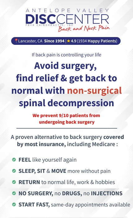
The revision names the non-surgical decompression approach and frames value around feeling like yourself, sleeping, sitting, moving and returning to work or hobbies. Local tenure and a rating share a compact trust strip.

The design hypothesis

Outcome language gives the visitor a recognizable reason to consider the service. Naming the approach helps distinguish the offer before visitors encounter a form. The stronger hierarchy groups location, proof, promise and benefits into a deliberate sequence.

What to validate

The hero includes surgery avoidance, insurance and 9/10 claims that the Figma file does not substantiate. Verify their evidence and scope. Ratings differ between the original header and map; use an accurate, current source.

02 / CONSULTATION + CALLBACK

Offer two ways to take the next step.

ORIGINAL CONTEXTOpen image ↗
FRYE original context Consultation + callback
REVISEDOpen image ↗
FRYE revised Consultation + callback

Original

The original asks visitors to take a 45-second qualification quiz and immediately displays the first form question. The captured widget includes a loading indicator and a custom-option placeholder.

What changed

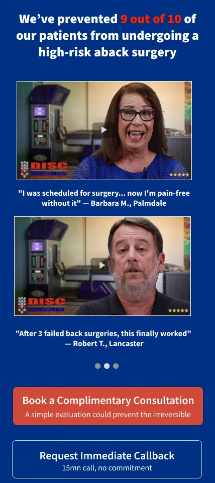
Two large CTAs replace the exposed quiz in the hero: book a complimentary consultation, or request a 15-minute callback with no commitment. The filled consultation button has priority; the outlined callback is secondary.

The design hypothesis

The revised choice can accommodate visitors ready to book and visitors who first want a conversation. Explicit duration and commitment reduce uncertainty about the next interaction. This trades the quiz’s self-qualification for greater contact choice.

What to validate

Compare qualified bookings and attended consultations, not button clicks alone. Verify where each CTA leads, availability, response time, form fields and qualification. A static export cannot establish any of those behaviours.

03 / PROBLEM + URGENCY

Introduce the cost of waiting carefully.

ORIGINAL CONTEXTOpen image ↗
FRYE original context Problem + urgency
REVISEDOpen image ↗
FRYE revised Problem + urgency

Original

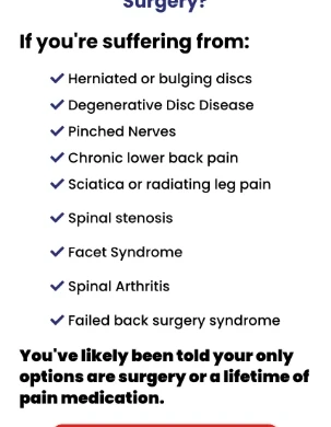
The original asks “Told You Need Back Surgery?” and presents a symptom list followed by an appointment CTA. It does not contain an equivalent early warning block.

What changed

A new ATTENTION section warns about delaying evaluation and uses a patient narrative about initially tolerable pain becoming disruptive.

The design hypothesis

This attempts to make the decision timely by connecting discomfort to lost sleep and everyday limitations. It may increase relevance, but fear-led language can also increase anxiety and reduce trust.

What to validate

Treat this as a persuasion hypothesis, not a medical conclusion. Have the clinical team review the warning and avoid implying that every visitor risks permanent harm or needs this treatment.

04 / GUARANTEE + FINANCIAL CONCERN

Address the fear of paying without improvement.

ORIGINAL CONTEXTOpen image ↗
FRYE original context Guarantee + financial concern
REVISEDOpen image ↗
FRYE revised Guarantee + financial concern

Original

The original emphasizes a free consultation and includes affordability and insurance points near the bottom. It does not show the same treatment guarantee.

What changed

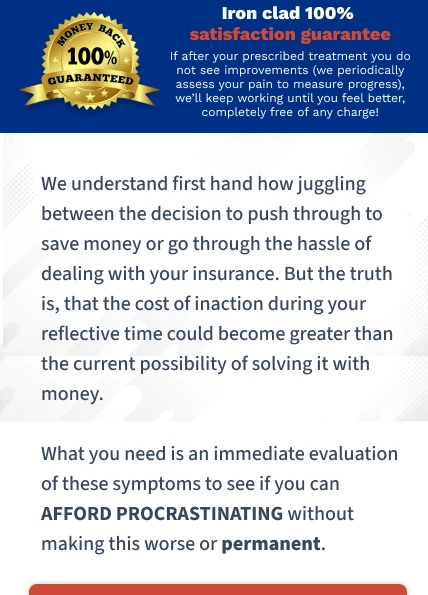
The revision adds an “iron clad 100% satisfaction guarantee” promising further work without charge if improvement is not seen, alongside copy about cost, insurance and delaying evaluation.

The design hypothesis

A clearly defined service guarantee may reduce uncertainty about financial commitment. Empathetic cost language can acknowledge a real hesitation before asking for contact again.

What to validate

The guarantee concerns continued service, not a verified clinical outcome. State eligibility, duration, assessment and exclusions clearly. Several text blocks overlap in this draft, so the intended guarantee hierarchy is not yet reliably readable.

05 / PATIENT EVIDENCE

Turn testimonials into relevant stories.

ORIGINAL CONTEXTOpen image ↗
FRYE original context Patient evidence
REVISEDOpen image ↗
FRYE revised Patient evidence

Original

Four patient-video thumbnails appear under “Patient Stories,” followed by a general Google rating and a testimonials area that is blank in the supplied capture.

What changed

The revision brings a surgery-avoidance claim above two selected videos and adds specific quote captions about avoiding a scheduled surgery and experience after failed surgeries. Another patient quote appears later.

The design hypothesis

Specific captions can help visitors decide whether a story resembles their situation before pressing play. Fewer selected examples reduce the effort of scanning a large video stack.

What to validate

Verify consent, quote accuracy and testimonial provenance. Individual stories do not prove typical effectiveness. The case study reports what the design says, without validating its surgery-avoidance numbers.

06 / TREATMENT EXPLANATION

Make the treatment tangible.

ORIGINAL CONTEXTOpen image ↗
FRYE original context Treatment explanation
REVISEDOpen image ↗
FRYE revised Treatment explanation

Original

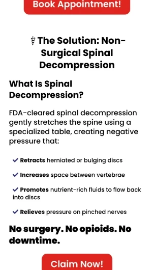
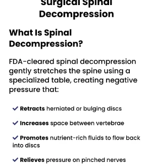
A short “What Is Spinal Decompression?” section describes a specialized table and lists proposed effects, followed by “No surgery. No opioids. No downtime.”

What changed

The revision introduces the DRX-9000 by name, includes a treatment image and positions the clinic’s equipment as a local differentiator. It contrasts the device with conventional traction and manual treatment.

The design hypothesis

A named device and visible setup can answer “what will actually happen to me?” Mechanism explanation is useful when visitors understand their pain but are unfamiliar with the proposed service.

What to validate

Confirm device identification, local exclusivity and all comparative clinical claims. A more specific mechanism story is a design choice, not proof that the stated physiological effects occur.

07 / SUITABILITY

Use the page to qualify, not only persuade.

ORIGINAL CONTEXTOpen image ↗
FRYE original context Suitability
REVISEDOpen image ↗
FRYE revised Suitability

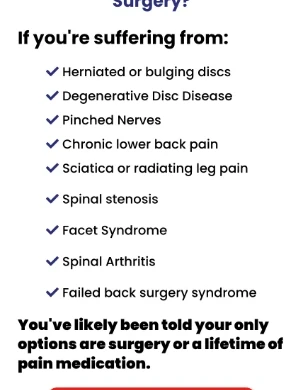
Original

The original lists conditions under “If you’re suffering from,” followed by a statement that the visitor has likely been offered surgery or ongoing medication.

What changed

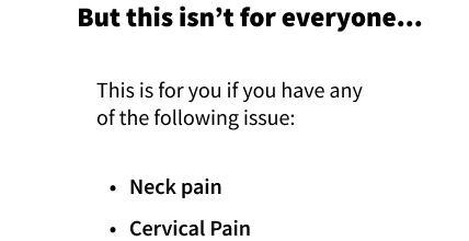
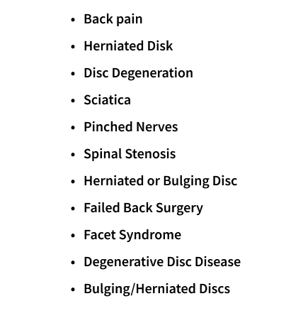
The revision adds “But this isn’t for everyone” and expands a list of conditions that might prompt consideration of an evaluation.

The design hypothesis

Making fit explicit may help visitors self-identify and prepare more useful enquiries. Qualification is especially valuable when the commercial outcome is an appropriate, attended consultation.

What to validate

The list contains repeated disc conditions and awkward terminology. Simplify it and have clinicians define actual eligibility. A diagnosis appearing in a list should not imply automatic suitability.

08 / MECHANISM BENEFITS

Explain the proposition without overstating it.

ORIGINAL CONTEXTOpen image ↗
FRYE original context Mechanism benefits
REVISEDOpen image ↗
FRYE revised Mechanism benefits

Original

The original uses short bullets about discs, vertebral space and nerve pressure.

What changed

The revision expands into a “ROOT CAUSE” argument with claims about rehydration, disc height, compression, adjacent segments and support.

The design hypothesis

This supplies an explanation for visitors who need more than an outcome promise. However, dense mechanism copy can interrupt the decision flow, especially when it adds new concepts rather than answers a clear objection.

What to validate

These are clinical assertions in the design, not verified facts from this analysis. Require supporting evidence and clinician review. The suitability and mechanism text currently overlap visually; separate them before judging the final hierarchy.

09 / EXCLUSIONS

Show who needs a different next step.

ORIGINAL CONTEXTOpen image ↗
FRYE original context Exclusions
REVISEDOpen image ↗
FRYE revised Exclusions

Original

The original shows a condition list but no comparable explicit exclusion block in the supplied full capture.

What changed

The revision adds a “NOT for you” section covering pregnancy, fracture, osteoporosis, infection, instability, hardware configurations and situations requiring immediate surgery.

The design hypothesis

Exclusions can counter the impression that one offer is appropriate for everyone. They may reduce unsuitable enquiries and give the clinic a more credible, selective positioning.

What to validate

Have clinicians approve the list and the recommended next action for people who fall outside eligibility. Measure lead quality and screening workload rather than assuming fewer enquiries is a negative result.

10 / TREATMENT JOURNEY + EXPECTATIONS

Answer the practical questions before the visit.

ORIGINAL CONTEXTOpen image ↗
FRYE original context Treatment journey + expectations
REVISEDOpen image ↗
FRYE revised Treatment journey + expectations

Original

Practical information in the original centers on location, opening hours, insurance and the consultation offer. It does not explain a multi-week treatment journey.

What changed

“How It Works” describes the initial call, candidacy, insurance and costs, session contents, a proposed schedule and expected progression over several weeks.

The design hypothesis

Making the process visible helps visitors estimate time, effort and cost uncertainty. This may improve preparedness and attendance even if it does not maximize raw form submissions.

What to validate

Verify the proposed session frequency, duration, downtime and numerical improvement/follow-up claims. Describe variation honestly. The dense uninterrupted text needs clearer step headings and spacing for mobile reading.

11 / DOCTOR + TEAM

Put a person behind the promise.

ORIGINAL CONTEXTOpen image ↗
FRYE original context Doctor + team
REVISEDOpen image ↗
FRYE revised Doctor + team

Original

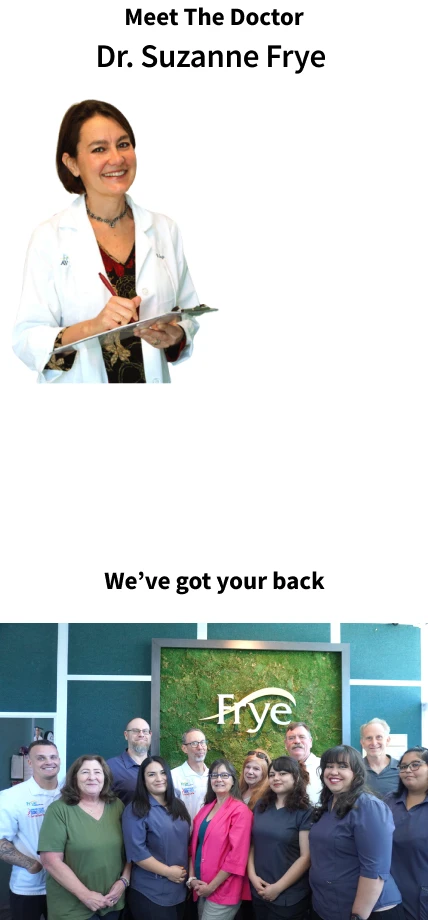
The original ends with clinic details, opening hours and a map. It lacks an equivalent dedicated practitioner and team introduction in the supplied capture.

What changed

The revision adds “Meet The Doctor,” names Dr. Suzanne Frye and follows with a team photograph under “We’ve got your back.”

The design hypothesis

A visible practitioner and real team can help visitors imagine who they will meet. This supports interpersonal trust after a long page focused on the problem and device.

What to validate

Add verified credentials, relevant experience and a clear connection to the consultation. Portraits alone do not supply that evidence. Confirm the identity and permission for every image.

12 / LOCAL DETAILS + FINAL CONVERSION

Finish with a complete route to the clinic.

ORIGINAL CONTEXTOpen image ↗
FRYE original context Local details + final conversion
REVISEDOpen image ↗
FRYE revised Local details + final conversion

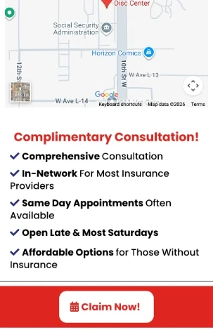
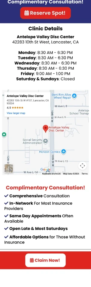
Original

The original includes address, hours, map, insurance and affordability, plus a final CTA. It also says most Saturdays are available while the hours say weekends are closed.

What changed

The selected revision ends its visible content with the team photograph and then leaves a large empty canvas. The original’s complete local-information close is not reproduced there.

The design hypothesis

A richer educational page still needs a clear final action and practical route to care. Location, accurate hours and contact details support the visitor who has read enough and is ready to act.

What to validate

Restore a closing CTA and local details, reconcile hours and appointment promises, and remove unused canvas space. The revised frame is 16,555 pixels tall, but visible content ends around 8,000; this is a draft-layout issue, not useful page content.

MEASURE THE BUSINESS OUTCOME

A lead is the start.
Attendance is the next test.

Measure qualified consultation bookings per visitor and attended consultations per visitor. Track callback contact rate, screening outcomes, no-shows and cost per attended consultation. Separate the two CTA paths so a rise in callbacks cannot conceal weaker booking quality.

Source match: original capture 181:235 and adjacent revision 194:355. The original matches the supplied screenshot’s quiz and headline; the revision matches its hero, trust strip and dual CTAs. Several revisions share that hero, so the analysis uses the full revision placed directly beside this original on the canvas. The original is a 303-pixel-wide raster capture; its comparison images retain that source resolution. The revised export includes unused canvas below the content.

Discuss your patient journey +