ADE MOJINSONFRACTIONAL CRO MANAGERAll selected work ↗

DESIGN BREAKDOWN / ROLLO / PRODUCT PAGE

Before the click.
Behind the decision.

A USB label printer.
A product page built to explain why it matters.

Control and treatment compared, with the behavioural observations that informed the recommendations.

THE EVIDENCE BOUNDARY

The board contains research observations and proposed designs, not a reported test outcome. Notes are attributed to the supplied board. Design rationale is an interpretation; no sales uplift is claimed.

THE RESEARCH QUESTION

What if the reasons to buy
arrive too late?

OBSERVATIONS IN THE BOARD

The notes report a 33% loss after the first scroll, mobile bounce of 43.93% versus 25.06% on desktop, and frequent gallery and Klarna interaction. The reporting period, sample sizes and metric definitions are not provided.

THE DESIGN RESPONSE

Bring a clearer benefit, a visible CTA, delivery and return reassurance, a nearby testimonial and comparison information into the earlier decision sequence.

The board contains multiple iterations and inconsistent reach estimates. These figures describe authored observations, not independently verified analytics. The displayed comparison uses the frames explicitly labeled Control and Treatment.

01 / HERO + VALUE PROPOSITION

Sell the outcome before the specification.
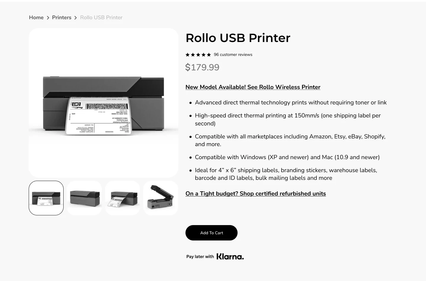
Control

“Rollo USB Printer” identifies the product, followed by a price and technical bullet points.

What changed

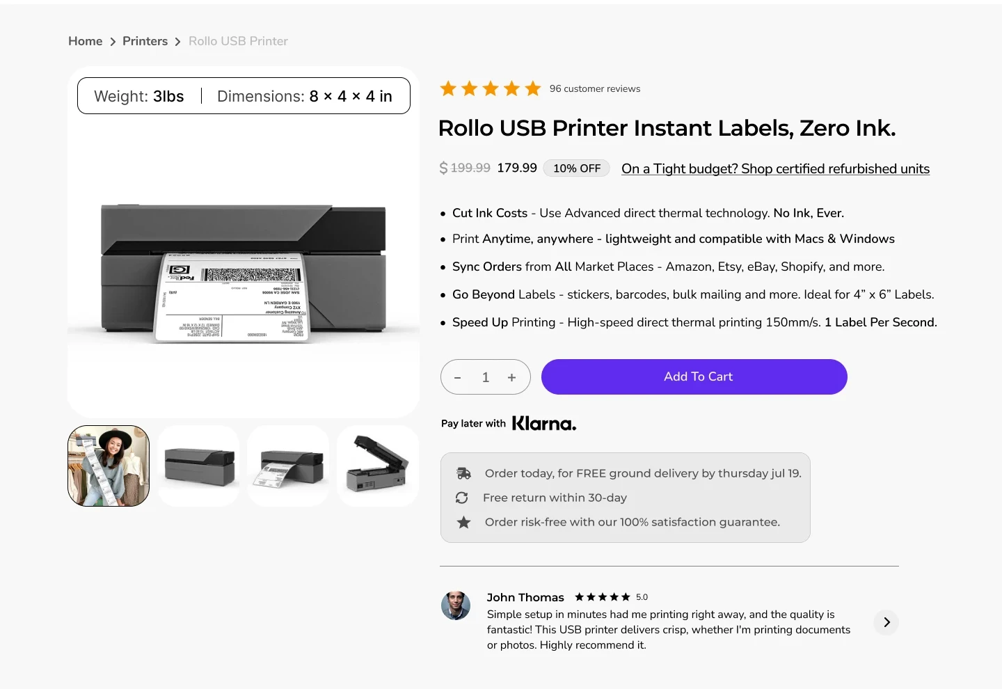
The treatment leads with “Instant Labels, Zero Ink” and rewrites bullets around actions such as cutting ink costs, printing anywhere and syncing orders.

The design hypothesis

The headline supplies a reason to care before asking visitors to interpret specifications. Benefit-led bullets can connect capability to the shipping task.

What to validate

Test comprehension and purchase conversion. The treatment still retains the refurbished link, so distraction removal remains a recommendation, not a completed change.

03 / CTA + REASSURANCE

Make the next action easier to see.

Control

A small black Add to Cart button sits below the product description; Klarna follows beneath it. Delivery, returns and warranty are much lower on the page.

What changed

The treatment uses a wider purple CTA beside the quantity selector. Delivery timing, free returns and a satisfaction message sit immediately below it, followed by a customer review.

The design hypothesis

A distinct action colour strengthens hierarchy. Nearby reassurance addresses delivery and return concerns at the moment the visitor considers buying. The review adds another reason to trust the choice.

What to validate

Add-to-cart and completed purchases, with checkout progression as a guardrail. Delivery dates must be dynamic and accurate. The notes flag Klarna clicks, but this static design cannot confirm that payment information became actionable.

04 / VALUE REMINDERS

Repeat the reasons to choose Rollo.

Control

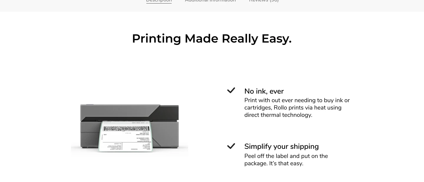
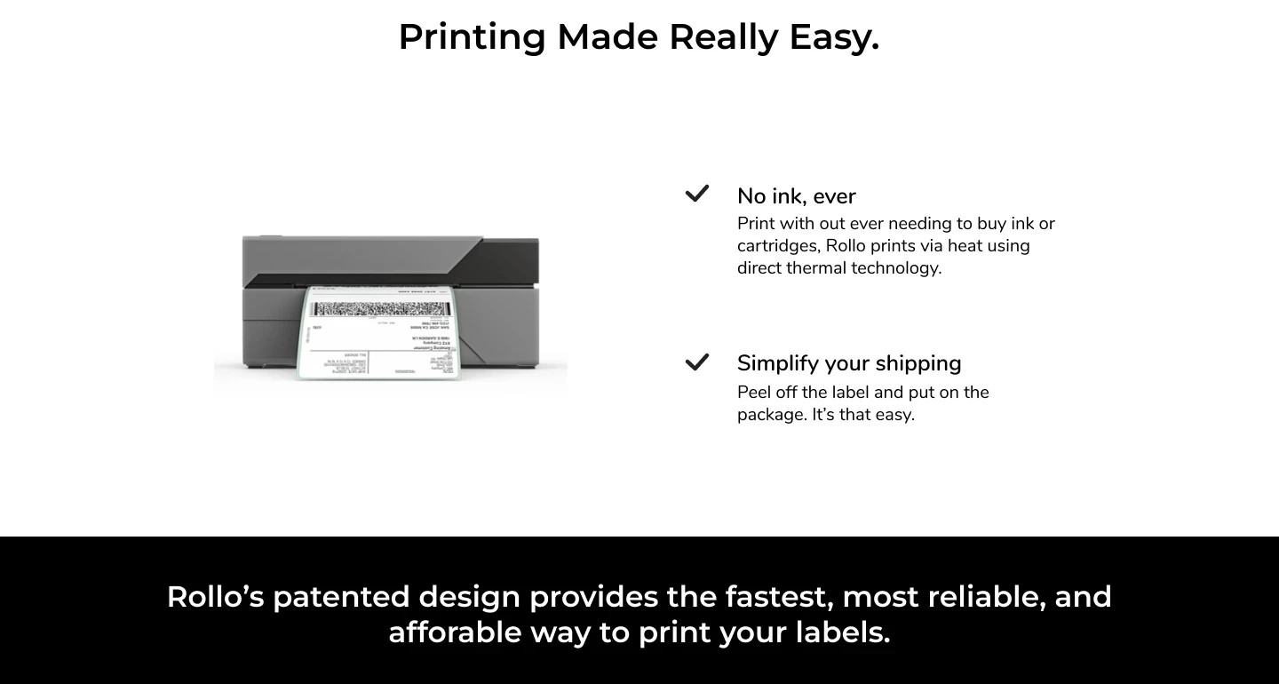
The control introduces “Printing Made Really Easy” and a separate two-benefit block after the purchase area.

What changed

The treatment adds a horizontal strip of value reminders near the product area, including no ink, service, durability and satisfaction reassurance.

The design hypothesis

The strip puts short decision cues closer to visitors who may never reach later sections. It can reinforce the offer without repeating a full explanation.

What to validate

Reach and recall. Avoid an unreadable or distracting moving strip. The treatment is 7,351 pixels tall versus 6,968 for the control, so it does not demonstrate the recommended shorter page.

05 / COMPETITIVE COMPARISON

Bring the comparison onto the page.

Control

The control uses an ease-of-use section with two benefits and a broad speed/reliability statement.

What changed

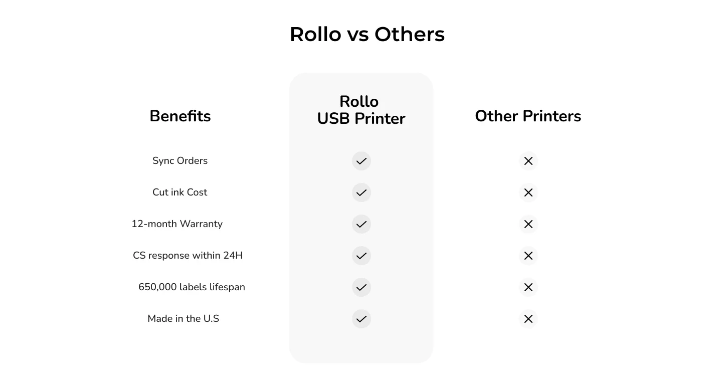
The treatment replaces that area with “Rollo vs Others,” covering order syncing, ink costs, warranty, service response, printing lifespan and origin.

The design hypothesis

The research notes interpret pauses as possible off-site comparison. A useful table may answer evaluation questions without requiring the visitor to leave, although the pauses alone do not prove that behaviour.

What to validate

Purchase conversion and research-related exits. Identify the competitors and substantiate each claim. A blanket “other printers” column cannot establish universal superiority.

06 / VIDEO DEMONSTRATION

A demonstration worth making stronger.

Control

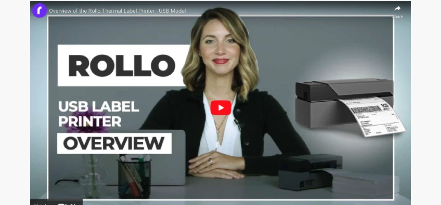
The control contains a presenter-led USB label printer overview.

What changed

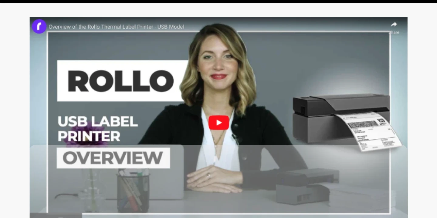
The treatment retains the same visible overview thumbnail, with an overlay in the supplied export. The board recommends a more compelling benefit demonstration or UGC replacement.

The design hypothesis

Demonstration can show the workflow and outcome rather than require the visitor to infer them from text. Here, replacing the video is a next-step hypothesis, not a visible completed optimization.

What to validate

Video starts, useful watch depth and downstream purchase. Assess the actual video and its mobile presentation before attributing an improvement to this section.

07 / INTEGRATIONS + USE CASES + FAQ

Preserve useful answers, examine their footprint.

Control

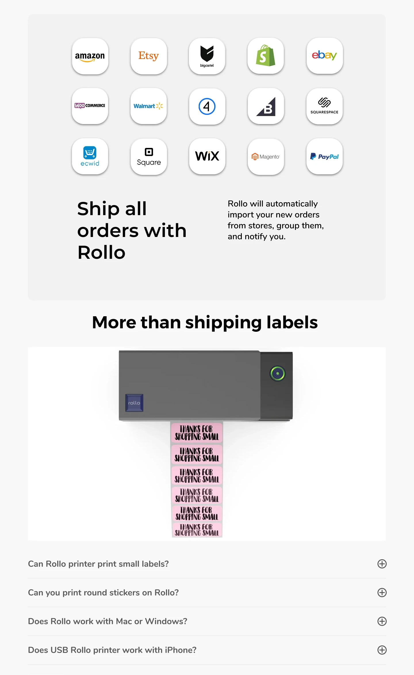
A large grid of commerce logos precedes “Ship all orders with Rollo,” another label-use image and four compatibility questions.

What changed

The treatment keeps this sequence and largely the same content. The board recommends a compact slider and notes drop-offs around the integration block, but the treatment still uses a large logo grid.

The design hypothesis

Compatibility matters for a USB printer. The opportunity is to make the answer easier to find and less costly to scan, without hiding important platform or device limitations.

What to validate

Integration-section reach and compatibility comprehension. These sections are retained rather than demonstrably redesigned. Verify USB, operating-system and mobile limitations in the final copy.

08 / SPECIFICATIONS + POLICIES + RELATED PRODUCTS

Keep technical and policy information available.

Control

Specifications, shipping, returns, warranty, related products and footer links conclude the control.

What changed

The treatment retains these sections while also surfacing selected reassurance near the CTA.

The design hypothesis

Detailed evidence remains available for careful evaluators. Repeating the most important policy cues near the CTA can support faster decisions without removing the full terms below.

What to validate

Support enquiries, returns and purchase conversion. Match the upper-page promises to the detailed policies, and check whether related products aid selection or divert ready-to-buy visitors.

FROM A STRONGER DESIGN TO A VALIDATED RESULT

Measure the purchase.
Not just the click.

Use purchase conversion as the primary outcome. Monitor revenue per visitor, checkout progression and returns. Break results out by device and acquisition channel when the sample supports it. More CTA clicks are useful diagnostic evidence, but they do not establish more sales.

Compared: Control frame 2:17 and Treatment frame 2:435. Research and recommendations are drawn from the accompanying board notes. Later explorations appear elsewhere on the board and are not presented here as part of this treatment. Static screenshots do not verify live interactions or measured outcomes.

Discuss your product page +