SHAPELY / MOBILE LANDING PAGE / RESEARCH + EXPERIMENT DESIGN
Understand the hesitation. Design the next step.
One original. Three ways forward.
Funnel analysis, behavioral evidence and customer language connected to patient proof, an interactive journey and a benefit-led hero.
RESEARCH & PROPOSED DESIGN
The March 2025 audit and the annotated Homepage designs linked from it are the source. The revisions are proposed variants, not a sequence of proven winners. No measured conversion uplift was supplied.
THE EVIDENCE LANDSCAPE
Audit slides + live dashboards. Explore every sheet.
FUNNEL × BEHAVIOR × CUSTOMER LANGUAGE × DESIGNTHE RESEARCH BEHIND THE HYPOTHESES.
START WITH THE REAL CONSTRAINT
Traffic was arriving. Confidence was not following.
THE BEHAVIORAL SIGNAL
The audit reports 83% of sessions on mobile, 97% of paid visitors leaving without starting the form, and concentrated clicks on a static hero image. Those observations prioritize the mobile entry experience, message continuity and a clearer next action.
THE CUSTOMER QUESTION
The review dashboards surface personalized care, feeling heard and ongoing support, alongside cost transparency, communication and delivery concerns. This shifts the design brief from “show the product” to “explain the experience and reduce uncertainty.”
Audit-reported figures reflect its source period and event definitions. The live dashboard compares 16 services; its counts are theme mentions, not unique patients. The audit describes 7,000+ reviews, which is a separate research-scope claim.
THREE DISTINCT HYPOTHESES
Same offer. Different paths to belief.
01 / PATIENT PROOF
Show the human outcome.
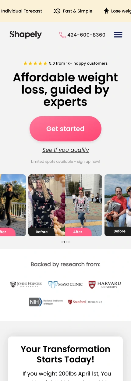
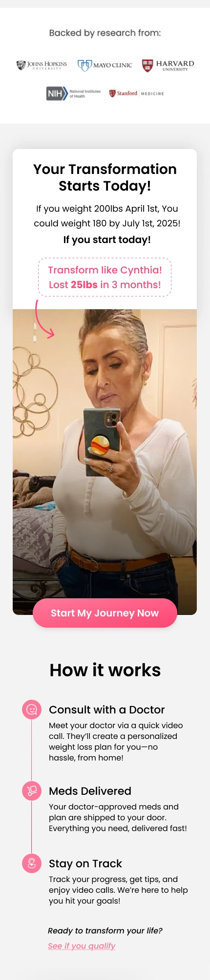
The revised hero replaces the product/app image with patient before-and-after proof, research logos and a secondary qualification CTA. An early Cynthia block connects the story to the process.
02 / INTERACTIVE JOURNEY
Invite participation.
A short weight-loss journey quiz appears near the top. The comparison comes before the price, with the plan order reversed.
03 / BENEFIT-LED HERO
Make the value easier to scan.
Five benefit bullets replace the hero product image, followed by Cynthia’s story. The clearer process and comparison support the offer further down.
FULL PAGES / ORIGINAL AGAINST EVERY VARIANT
Explore the entire journey.
Choose a variant. Scroll each source page independently.
The comparison below changes with your selection. Crops include neighboring content to preserve context. Numbered pink markers are annotations in the supplied Figma frames.
SECTION BY SECTION / CHANGED + RETAINED
What changes. Why it matters.
01 / THE DISTINCT CHANGES
Hero and first action
ORIGINAL
PATIENT PROOF
What is visible
The headline stays, but all three revised heroes add ratings. Patient proof replaces the app image with before/after photographs, adds a qualification link and research logos. The quiz retains the product image. The benefit-led version replaces it with five scan-friendly bullets.
The design reasoning
These are real differences in the after frames: human proof, product visualization, or explicit benefits. Patient evidence can help continuity with an acquisition story; benefit bullets can help visitors scan. Ratings, results, institutional associations and medical claims require substantiation.
02 / THE DISTINCT CHANGES
The first persuasion sequence
ORIGINAL
PATIENT PROOF
What is visible
Patient proof follows the hero with an early Cynthia transformation block. The quiz introduces goal, current weight, target weight and timeframe questions. The benefit-led version follows its bullets with the Cynthia block. All three then introduce How it works.
The design reasoning
The story-led sequences support identification and ad continuity; the quiz invites personal participation. The subsequent three steps explain consultation, delivery and tracking. These hypotheses should be isolated in testing rather than treated as proven improvements.
03 / THE DISTINCT CHANGES
What membership includes
ORIGINAL
PATIENT PROOF
What is visible
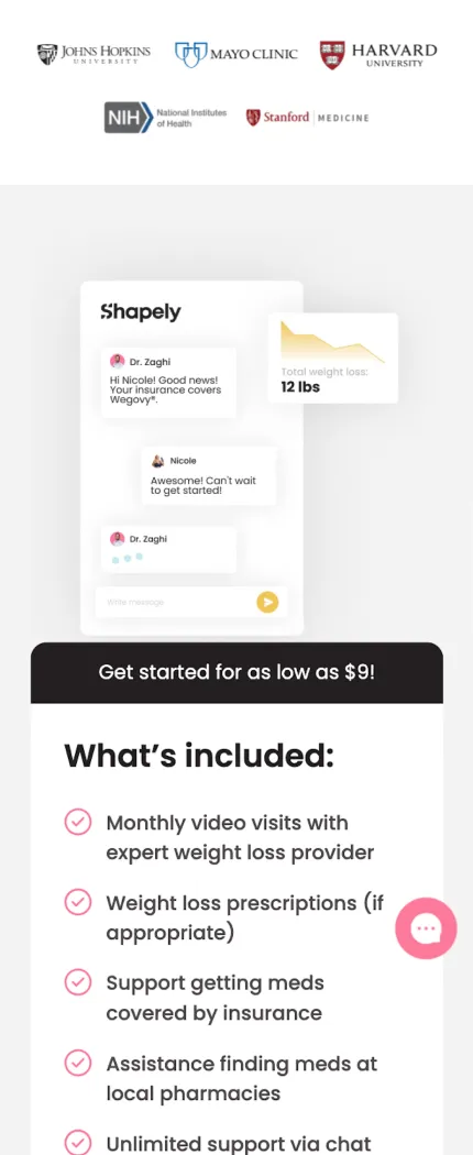
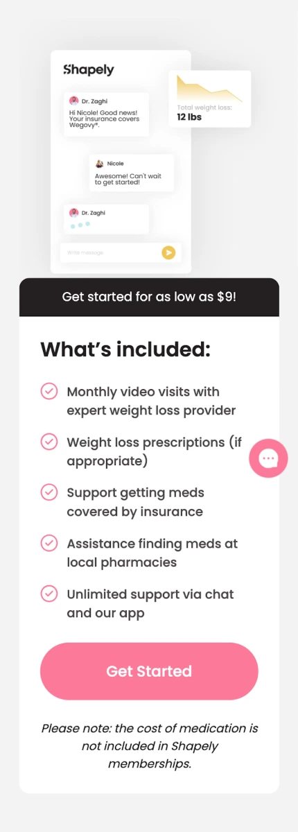
Each corrected revision retains the app demonstration and membership benefits after the new process explanation.
The design reasoning
The explanation gives features a practical role in the journey. Membership inclusions should help distinguish support from medication costs, instead of leaving visitors to infer the difference.
04 / THE DISTINCT CHANGES
Pricing and competitive choice
ORIGINAL
PATIENT PROOF
What is visible
All three corrected after pages place Why choose Shapely before the plan cards. The cards present the cash-pay option first and the insurance option second, unlike the original order.
The design reasoning
Differentiation now precedes cost evaluation. Plan order is a separate choice hypothesis. The source first-month discounts and exclusions should be explained clearly; a lower initial price does not equal a lower total program cost.
THE EXPERIMENT COMES NEXT
Design creates a hypothesis. Measurement earns the conclusion.
Test patient proof, the interactive journey and the benefit-led hero as distinct hypotheses against a stable control. Measure completed, qualified bookings per eligible visitor, with form starts, completion, appointment attendance and mobile performance as supporting signals. A quiz can increase engagement while adding friction; an early video can explain the offer while slowing the page.
The full-page after exports now come from the audit’s annotated Homepage page: HERO V.1 (5:1898), interactive journey (278:130), and benefit-led hero (5:2145). Outcome projections, patient stories, review counts, urgency and competitive claims in source artwork require substantiation before a production test. A projection is not a guaranteed clinical outcome.