ADE MOJINSONFRACTIONAL CRO MANAGERAll selected work ↗

VAYKLIFE / VACATION GEAR / EXPERIMENTATION

Less planning.
More vacation.

A clearer rental-shopping journey.
Different screens. Different results.

Nine design comparisons across desktop and mobile, plus six experiments from the supplied tracker. The story includes improvements, declines and flat outcomes.

THE EVIDENCE BOUNDARY

The tracker labels its rate columns “Conversation Rate”; the event definition, traffic counts and statistical uncertainty are not shown. All figures below are screenshot-reported rates. They are not verified revenue results or proof of significance. The supplied designs span multiple iterations, not one confirmed final winning page.

HOMEPAGE UPDATES / APRIL 24 TO MAY 17, 2025

The mobile improvement.
The desktop counterpoint.

MOBILE / REPORTED VERSION B / ROLLED OUT

+10.4% relative

15.11% → 16.68%, a +1.57 percentage-point difference. The tracker describes reviews below the fold, upgraded hero copy and a new CTA as one bundled change.

DESKTOP / REPORTED VERSION A / NOT ROLLED OUT

−14.1% relative

23.2% → 19.93%, a −3.27 percentage-point difference. The same experiment family did not produce a uniform result across devices.

COMPARE THE DESIGNS

01 / HERO + NAVIGATION

Lead with what arrives, not just the reservation.
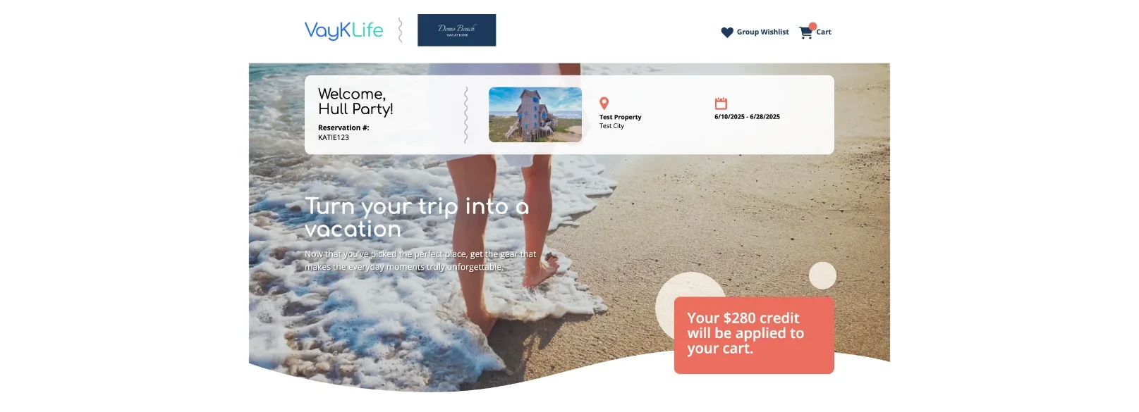
Control

The control welcomes the named travel party and displays property, reservation and dates over a generic shoreline image. A credit badge appears lower in the hero.

What changed

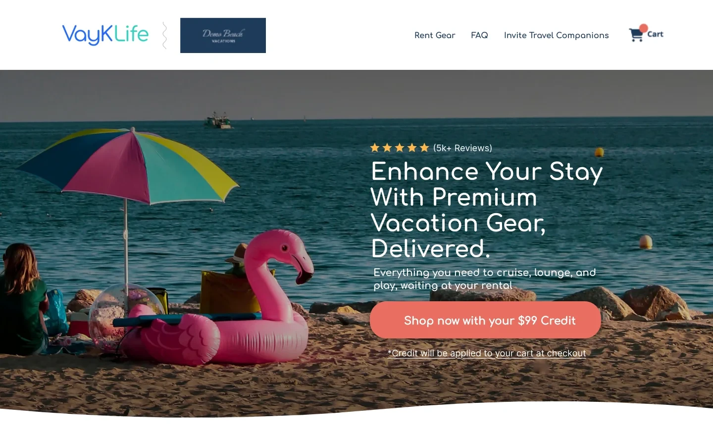
The revision uses vacation equipment in the hero, names premium gear and delivery, adds review reassurance and makes the available credit part of a visible shopping CTA. Navigation includes gear, FAQ and travel companions.

The design hypothesis

The revised first screen makes the service and next action more explicit. Gear imagery shows the proposition rather than asking visitors to infer it from a beach scene. However, reducing reservation details may weaken reassurance that the order is tied to the correct stay.

What to validate

Measure shopping progression and completed orders by device. The control mobile capture has a large gray hero region; it may be a capture/loading issue and does not prove the live design intentionally showed a blank hero.

02 / CREDIT + CTA

Make the credit an invitation to shop.

Control

The original uses a standalone “$280 credit will be applied to your cart” message and a free-standard-delivery strip, without an equivalent hero shopping button.

What changed

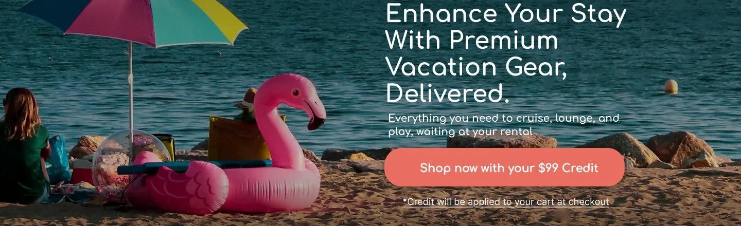
A coral “Shop now with your $99 Credit” CTA connects the credit to an action. A nearby footnote specifies that credit is applied at checkout.

The design hypothesis

Connecting a monetary benefit to an action may help visitors understand how to use it. The footnote supplies timing that could otherwise create uncertainty about the cart price.

What to validate

The displayed amounts differ, $280 versus $99. These may be different reservation examples rather than an offer test. Use the correct reservation-specific credit, eligibility and checkout calculation; do not attribute results to the amount difference.

03 / AVAILABILITY + POLICY REASSURANCE

Pair booking urgency with flexibility.

Control

The control reassurance strip emphasizes free standard delivery.

What changed

The shown revision changes it to “Book early, relax later,” mentions popular gear selling quickly and says cancellations are free, with a link to details. Other iterations in the file specify a two-day window.

The design hypothesis

The message tries to balance acting early with reduced commitment anxiety. It may answer “what if our plans change?” at the point of browsing packages.

What to validate

Match this statement to the real cutoff, exclusions and refund terms. Availability language should reflect actual stock. The accompanying tracker does not isolate the effect of this exact strip.

04 / RECOMMENDED PACKAGES

Adapt product browsing to the screen.

Control

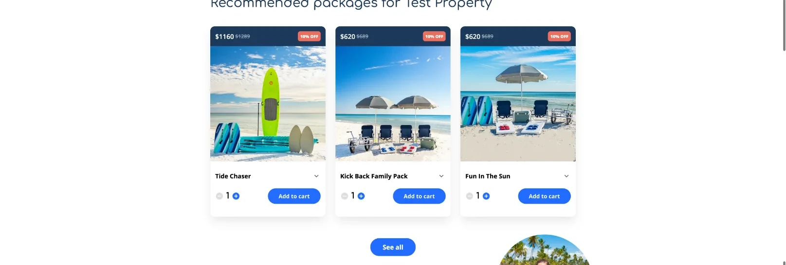
Desktop shows three package cards; mobile stacks three large cards vertically, with price, image, quantity and add-to-cart controls.

What changed

The desktop preserves the three-card structure. The revised mobile layout uses a horizontal card sequence, prominently showing one card with adjacent cards peeking into view, plus carousel indicators.

The design hypothesis

Horizontal browsing can expose package choice without requiring a long vertical scroll. The neighboring card edge signals that more options are available. The tradeoff is that swiping can hide alternatives and make comparison harder.

What to validate

Validate swipe discovery, keyboard access, quantity changes and add-to-cart accuracy. Product imagery and names differ in the mobile mockup, so the screenshot does not demonstrate a pure layout-only comparison.

05 / FEATURED GEAR + CROSS-SHOPPING

Keep individual gear visible and invite collaboration.

Control

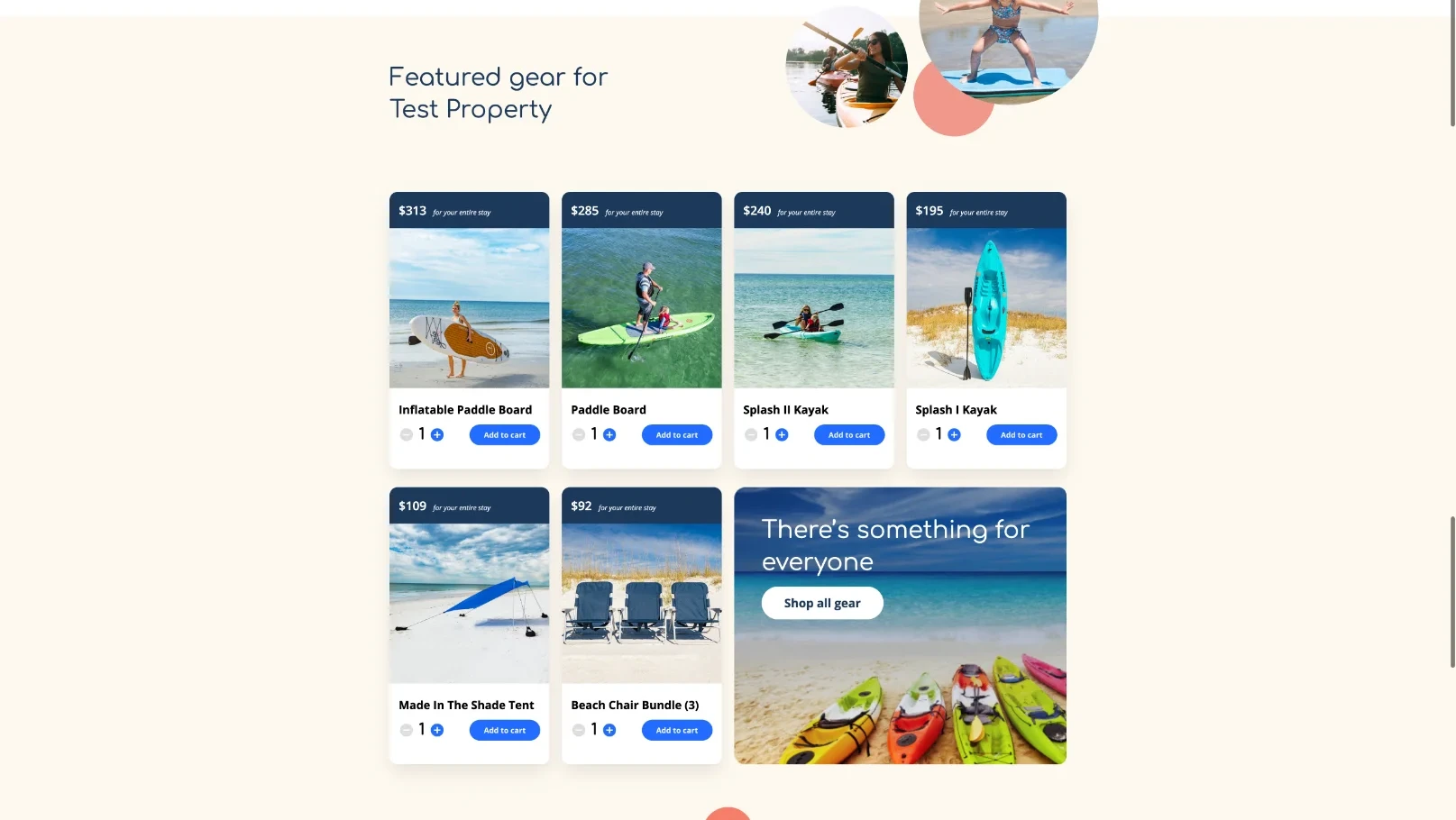
The control uses a desktop grid and long mobile stack of individual gear, with a “Shop all gear” tile.

What changed

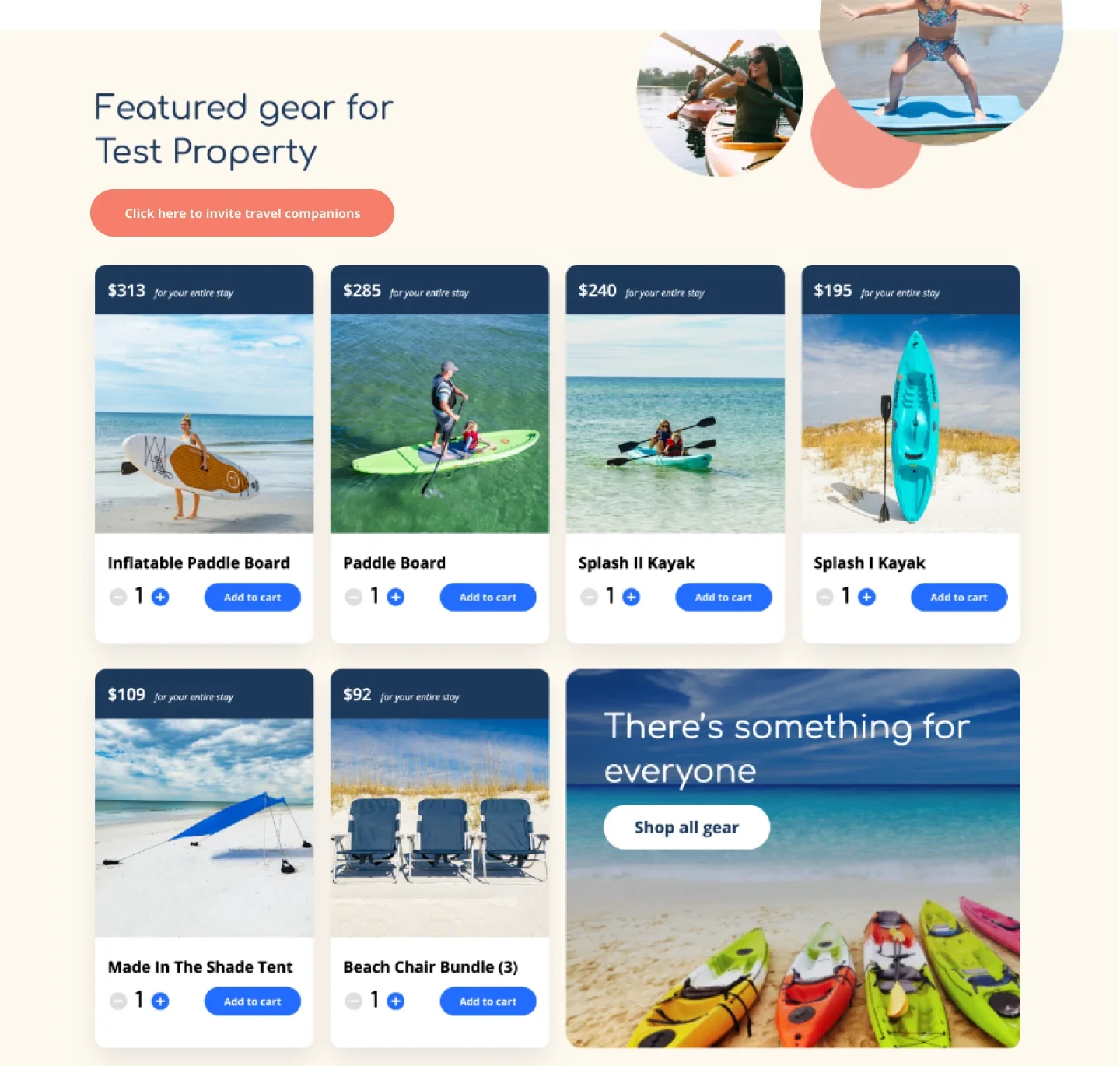
Desktop retains the grid and adds an invitation link near the featured-gear heading. Mobile uses another horizontal card sequence followed by the all-gear tile.

The design hypothesis

Showing packages and individual items serves different shopping needs. An early companion invitation may help a group coordinate gear choice rather than leaving one traveler to guess everyone’s preferences.

What to validate

Track gear selection, package substitution, order value and invitation completion. The tracker’s featured-items experiment did not favor treatment on either device; added merchandising is not automatically a win.

06 / REVIEW PLACEMENT

Put proof where it supports the decision.

Control

The original places a coral testimonial band much later, after experiences. It does not show an equivalent early featured-review card.

What changed

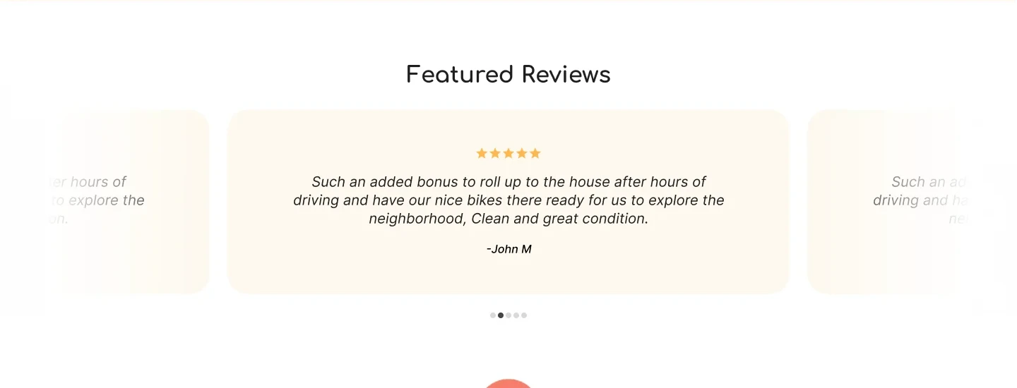
The shown mobile revision adds a featured review immediately below the hero. Desktop instead places a featured-review carousel after the gear grid, while retaining the later testimonial band.

The design hypothesis

The selected quote describes gear waiting at the house, cleanliness and condition, directly addressing fulfillment concerns. Placement changes the tradeoff between reassurance and delaying access to products.

What to validate

The homepage tracker reports different device outcomes, with mobile improving and desktop declining. Do not generalize one placement across both. The desktop middle-page placement may represent a later iteration; the file alone cannot establish an exact experiment-to-frame mapping.

07 / GROUP WISHLIST

Preserve the group-planning job.

Control

The control includes a dark-blue group-wishlist section with an Invite others CTA after gear.

What changed

The revision retains that section and adds companion entry points in navigation and near featured gear.

The design hypothesis

The group feature has a role beyond immediate checkout: sharing a plan may help settle which items to rent. Multiple relevant entry points can improve discovery when travelers are ready to collaborate.

What to validate

Measure invites accepted, shared-list use and eventual orders. More invitation clicks could simply divert visitors from buying unless collaboration produces a useful downstream outcome.

08 / LOCAL EXPERIENCES

Keep the wider vacation offer available.

Control

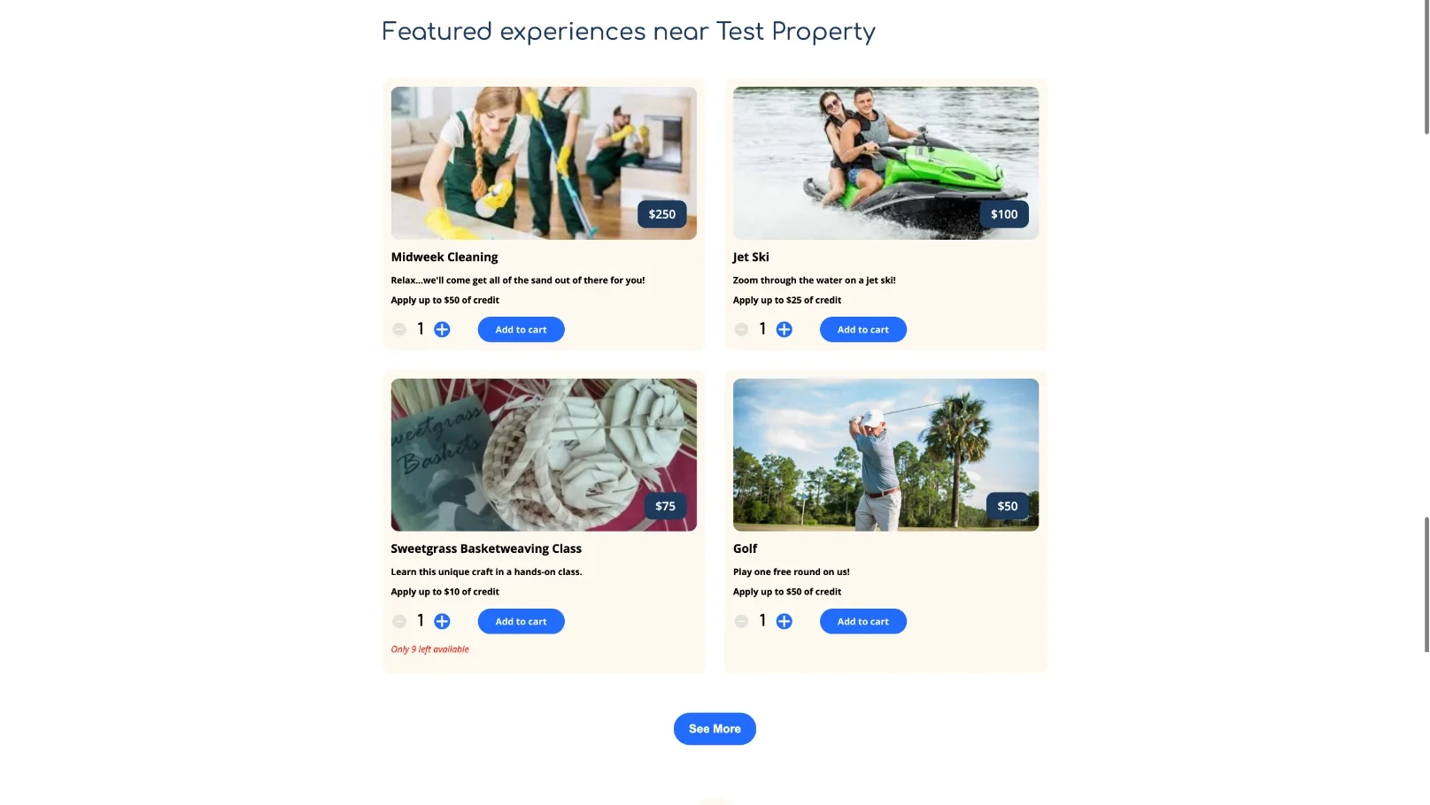
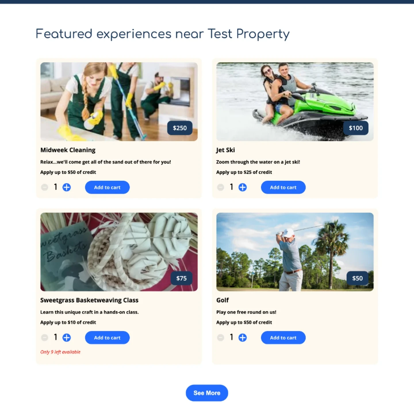
Both layouts offer experiences such as cleaning, jet ski activities, basketweaving and golf, with prices, credit details and add-to-cart actions.

What changed

The desktop retains a two-column set and mobile retains a vertical list. The supplied revisions mainly change the surrounding journey rather than redesign this section.

The design hypothesis

The wider offer can help travelers use eligible credit across useful vacation activities. Retaining recognizable card controls also reduces the need to learn a second interaction pattern.

What to validate

Check which experiences accept credit, availability and provider terms. This is largely retained content, not a demonstrated optimization. Track order composition and fulfillment rather than only experience-card clicks.

09 / FAQ + FOOTER + CONSENT

Keep delivery questions within reach.

Control

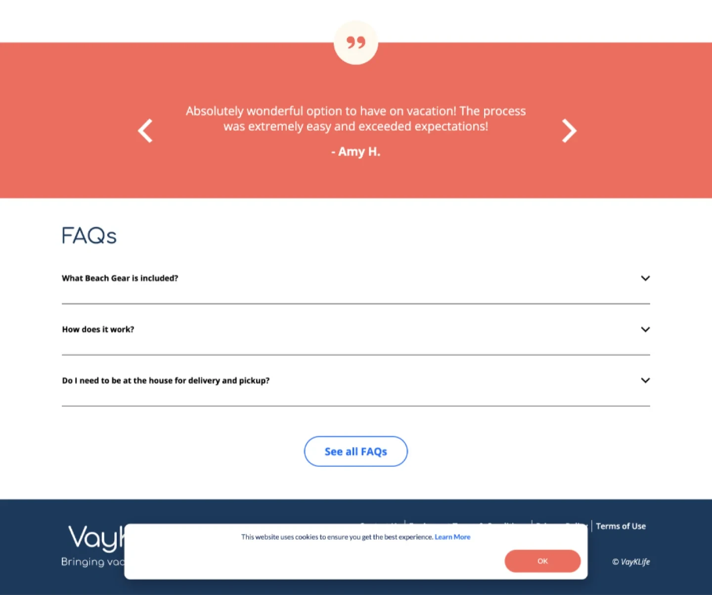
The control concludes with a testimonial band, FAQs about included gear and delivery/pickup, footer links and a cookie notice.

What changed

The revision retains that closing structure while adding earlier proof and FAQ entry points.

The design hypothesis

Delivery and pickup questions can be decisive for rental shoppers. Keeping answers accessible supports visitors who need practical certainty before committing, even if they never read the whole page.

What to validate

Test FAQ accessibility, policy links, consent behaviour and cart persistence. Static Figma exports cannot establish that accordions, carousels, sharing or checkout work correctly.

REPORTED EXPERIMENTS / 2025

Keep the full record.
Including the flat tests.

Differences below are calculated from the screenshot’s rounded A and B rates. “Decision” and “winner” labels are transcribed from the tracker, not conclusions from an independent statistical analysis. Tests use different dates and populations; their lifts must not be added together.

ExperimentDeviceDatesChangeABDifferenceRelativeTracker decision
1 / Featured itemsDesktopMar 27 to Apr 24, 2025No featured items → featured items19.35%18.94%-0.41 pp-2.12%A / not rolled out
1 / Featured itemsMobileMar 27 to Apr 24, 2025No featured items → featured items8.77%8.6%-0.17 pp-1.94%A / not rolled out
2 / Damage protectionDesktopApr 6 to Aug 10, 2025Original copy → alternative copy28.71%29.37%+0.66 pp+2.30%B / decision TBD
2 / Damage protectionMobileApr 6, 2025; end not shownOriginal copy → alternative copy20.65%20.95%+0.30 pp+1.45%B / decision TBD
3 / Homepage updatesDesktopApr 24 to May 17, 2025Hero copy + CTA + review placement23.2%19.93%-3.27 pp-14.09%A / not rolled out
3 / Homepage updatesMobileApr 24 to May 17, 2025Hero copy + CTA + review placement15.11%16.68%+1.57 pp+10.39%B / rolled out
4 / ReviewsDesktopMay 18 to Jun 10, 2025Reviews below fold → middle of page28.3%28.29%-0.01 pp-0.04%Flat / rolled out
4 / Card layoutMobileMay 18 to Jun 10, 2025One card visible → two cards visible20.47%20.08%-0.39 pp-1.91%A / not rolled out
5 / ConsumablesDesktopJun 30 to Jul 22, 2025Blended categories → separate category28%28.04%+0.04 pp+0.14%Flat / technical rollout issue
5 / ConsumablesMobileJun 30 to Jul 22, 2025Blended categories → separate category20.22%20.05%-0.17 pp-0.84%Flat / technical rollout issue
6 / Card reviewsDesktopJun 12 to Aug 10, 2025No reviews → reviews on cards29.01%29.1%+0.09 pp+0.31%Flat / rolled out
6 / Card reviewsMobileJun 10 to Aug 10, 2025No reviews → reviews on cards21.53%21.84%+0.31 pp+1.44%B / rolled out

What the record supports

The homepage update is the largest reported mobile improvement in this screenshot. Damage-protection copy and card reviews show smaller numerical increases. Featured items and the two-card mobile layout favor the control.

What it does not establish

No sample sizes, confidence intervals, event definition or test reports are provided. Flat results are retained as flat even when the rounded numbers differ slightly. The record cannot isolate which part of the bundled homepage change caused its result.

Inspect the supplied tracker screenshot ↗

DESIGN, TEST, LEARN

The screen matters.
The outcome matters more.

Use completed orders and revenue per eligible reservation as business outcomes. Track credit usage, package mix, cart-to-checkout progression, cancellations and fulfillment costs. A separate mobile decision is justified by the device-specific pattern in the supplied record, but confidence needs the underlying test data.

Screenshot matches: desktop control capture 1:36, mobile control group 1:68, revised desktop 130:271 and revised mobile 130:15. The chosen pair matches the provided hero, booking strip, review placements and mobile card sequence. Other iterations share portions of this design; the tracker does not map test IDs to frame IDs. Images are static exports, not verified live behaviour.

Discuss your shopping journey +